Background
A page with technical debt
Xero is the largest accounting platform in Australia and New Zealand, supporting millions of small businesses. I worked on redesigning the UI and functionality of Organisation Details, a page that captures key information about a business.
The page hadn't seen product updates in years. Outdated patterns and legacy constraints made it difficult to build and improve on. The team's goal was to transform this page into a central place for customers to add and maintain their business details, as well as verify their accuracy throughout their time with Xero.
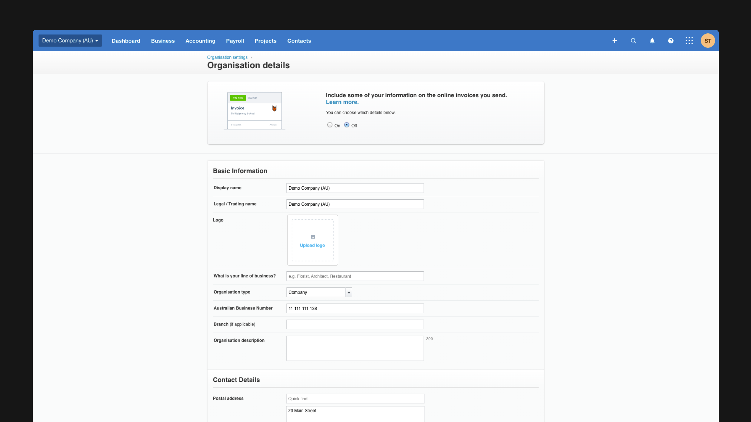
Previous design
Research
Documenting dependencies and keeping stakeholders updated
Because data entered into Organisation Details was fed into many other parts of Xero, design decisions here impacted other areas across the product. Keeping stakeholders across those teams informed was critical.
I created stakeholder and journey maps to align product teams and surface dependencies before any changes were made, including regional differences that needed to be accounted for.
This prevented us from accidentally removing or simplifying parts of the form that were actually needed for other areas of Xero.
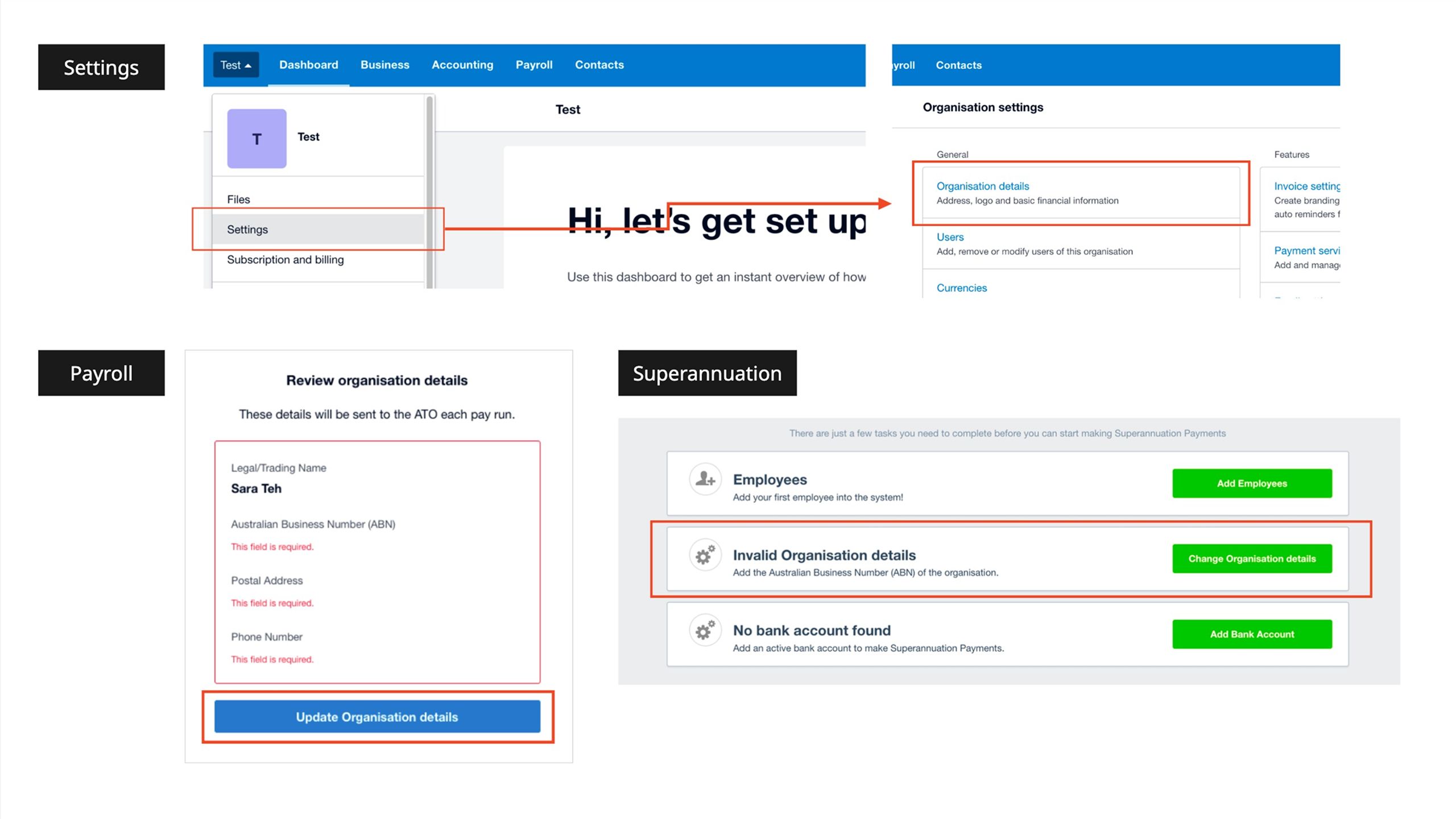
Multiple entry points
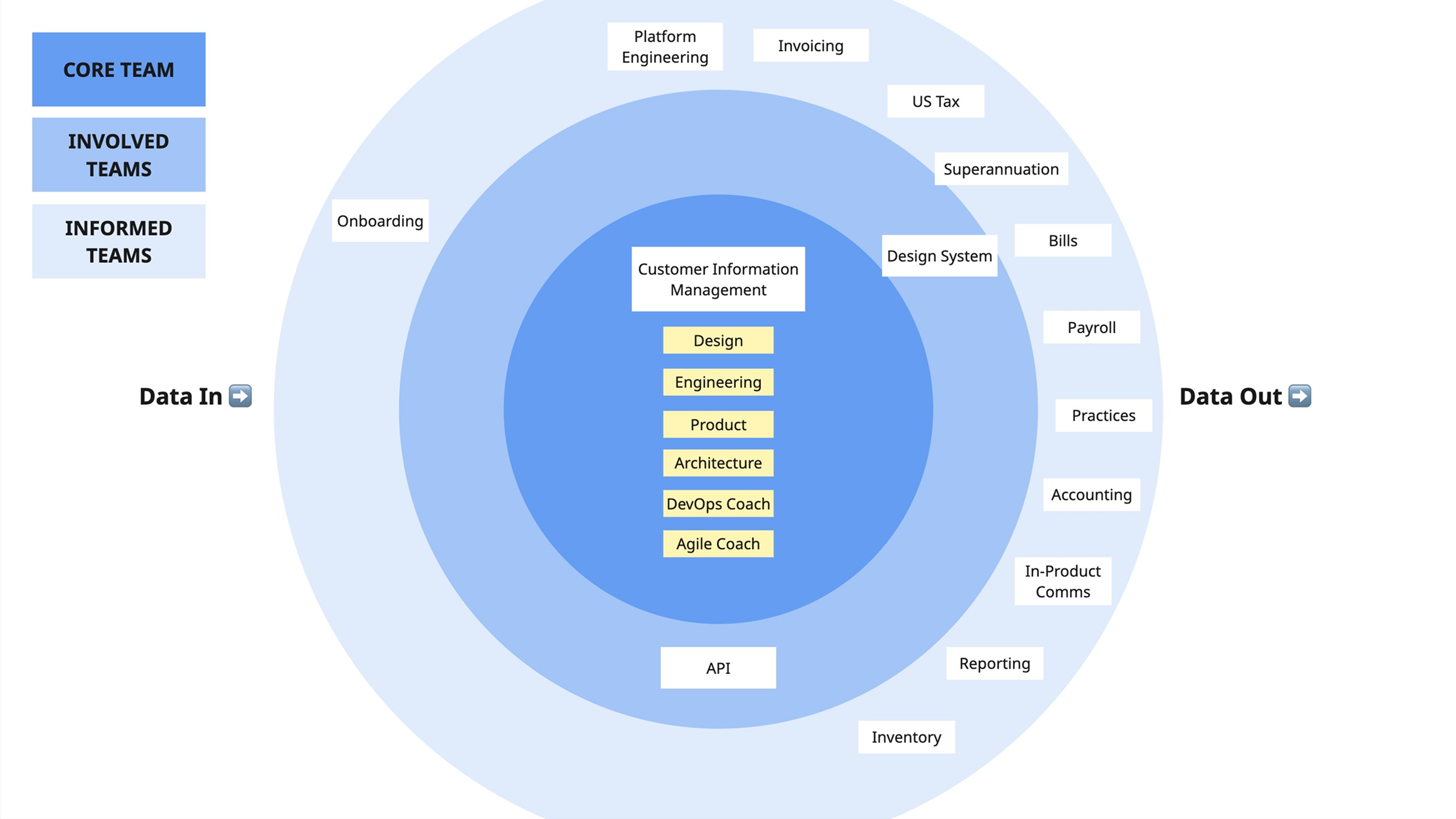
Simplified stakeholder map
Design
From wireframes to accessibility testing
Once I'd confirmed what could and couldn't change with the relevant product teams, I designed and iterated on several concepts using XUI (Xero's design system), mapping out flows for both the happy path and error handling. Through conducting accessibility testing via Fable, I received the following feedback:
- The banner was commanding too much attention and was confusing to users
- Users were not sure which fields were required and which were optional
- Some of the language used for the field titles and placeholder text was unclear
I iterated on the designs to address this feedback, then created handover documentation for the developers.
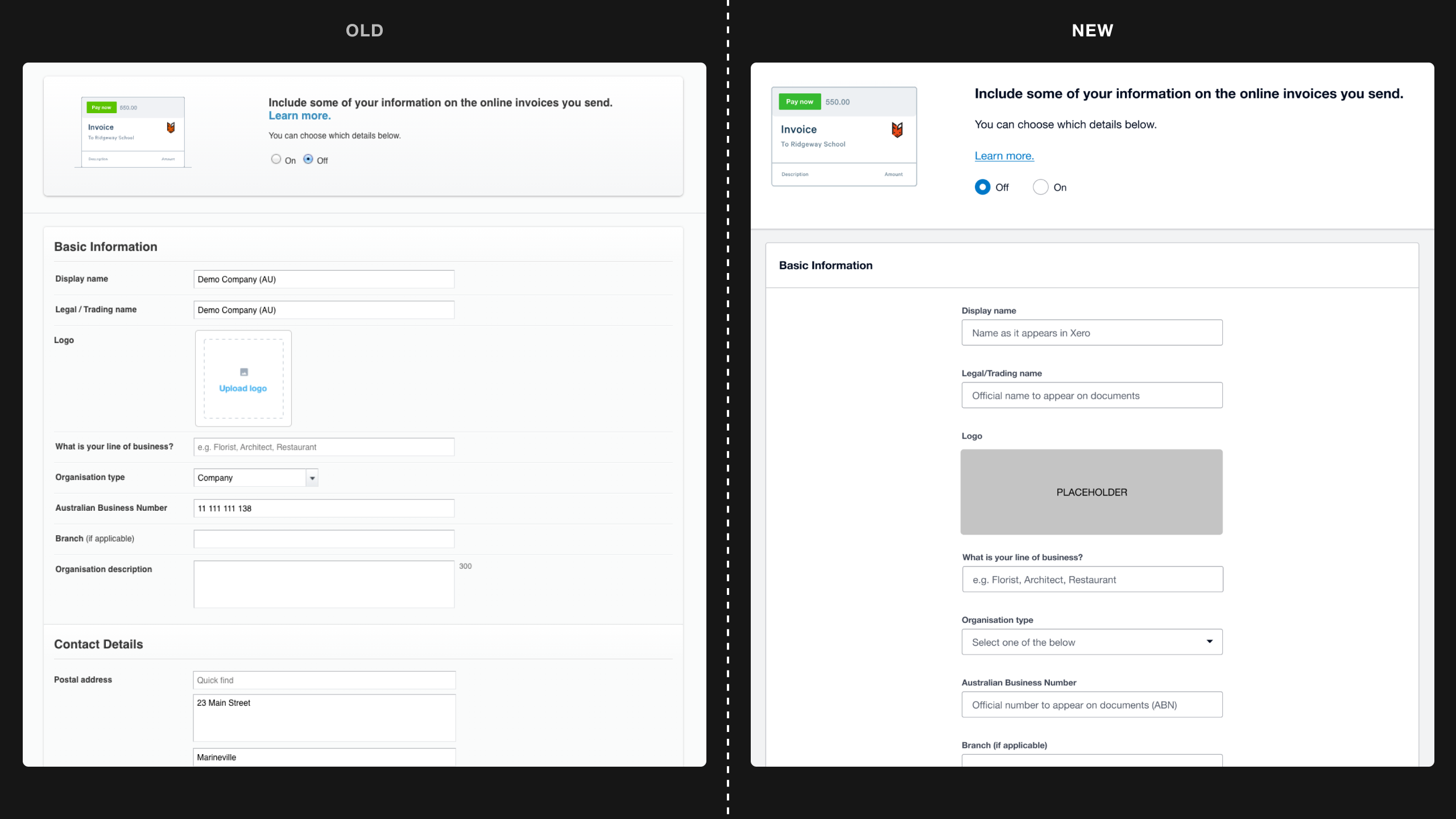
Old vs new design systems
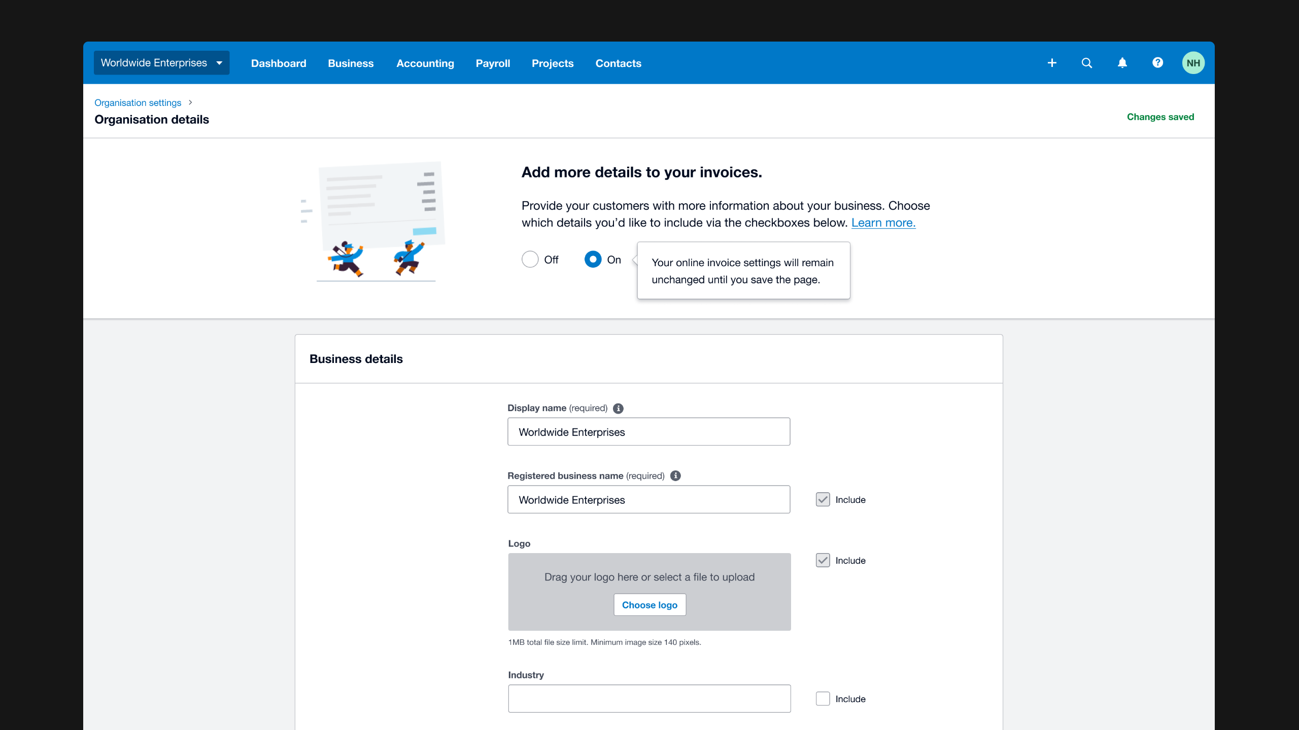
Further exploration
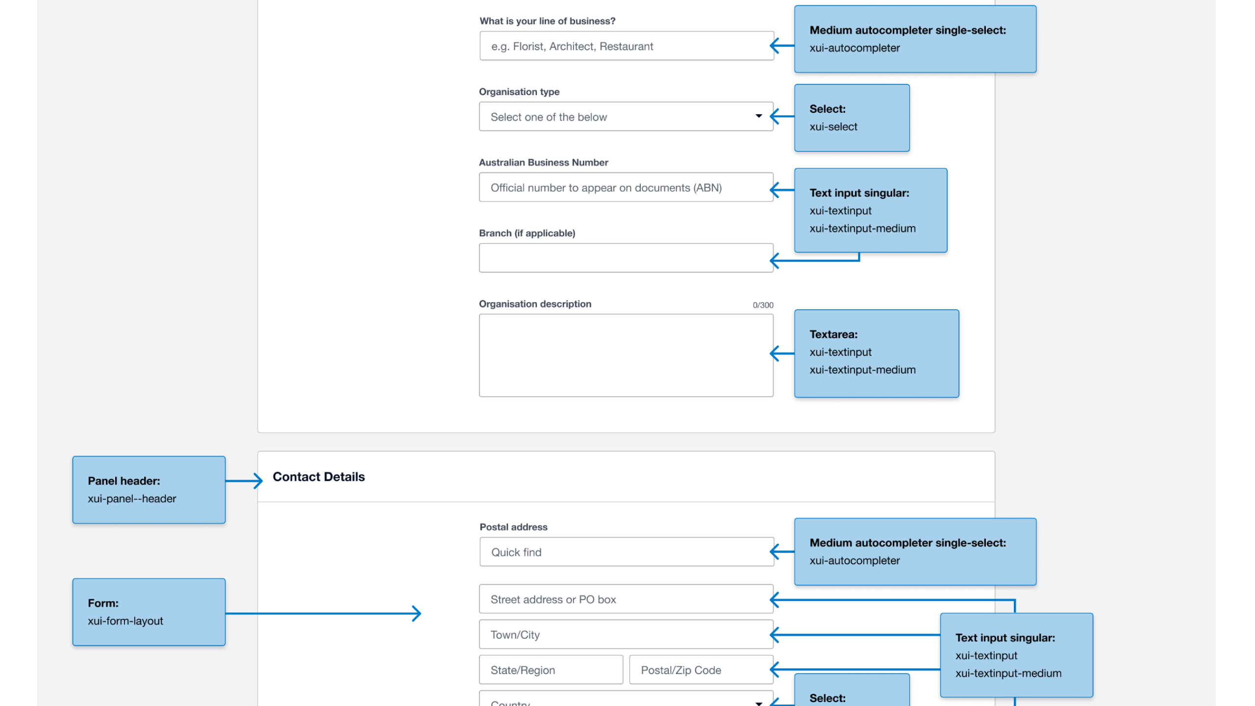
Design system handover for developers
Outcome
Turning feedback into a refined experience
The new Organisation Details page was rolled out to Australian customers on 26th April 2023, with the following changes:
- Refreshed the UI to align with the XUI design system guidelines
- Added ‘required’ labels to clarify mandatory fields
- Simplified the logo uploader from a two-step to one-step flow
- Replaced the attention-grabbing banner with a more subtle toggle
- Clarified the language used for field titles and placeholder text
- Improved data collection for Industry and country fields to allow for customisation in future updates
This modernisation prepared the page for future enhancements, and brought it closer to becoming a hub for business details. It now results in around 12,000 unique visits per month.
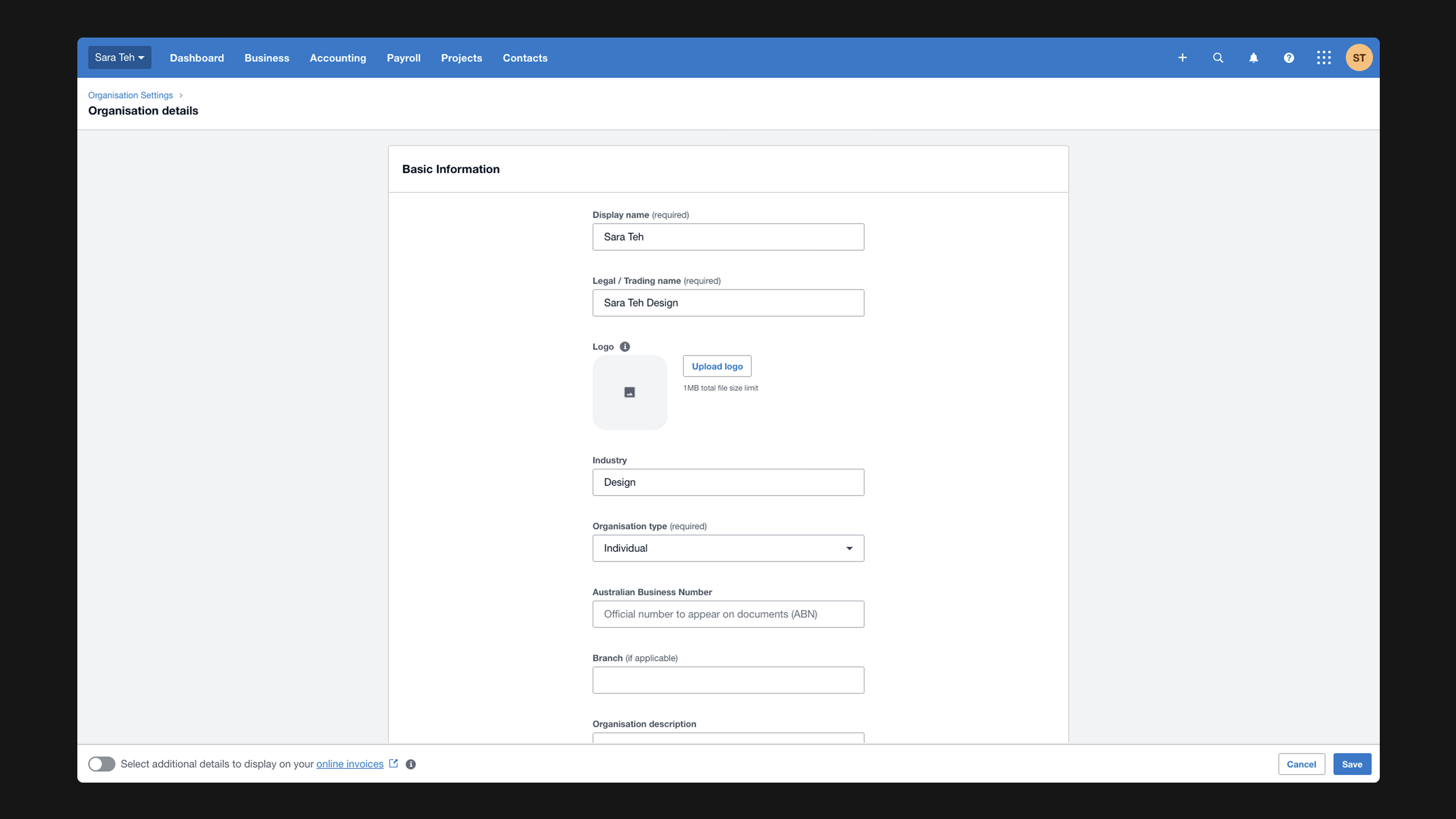
Final design